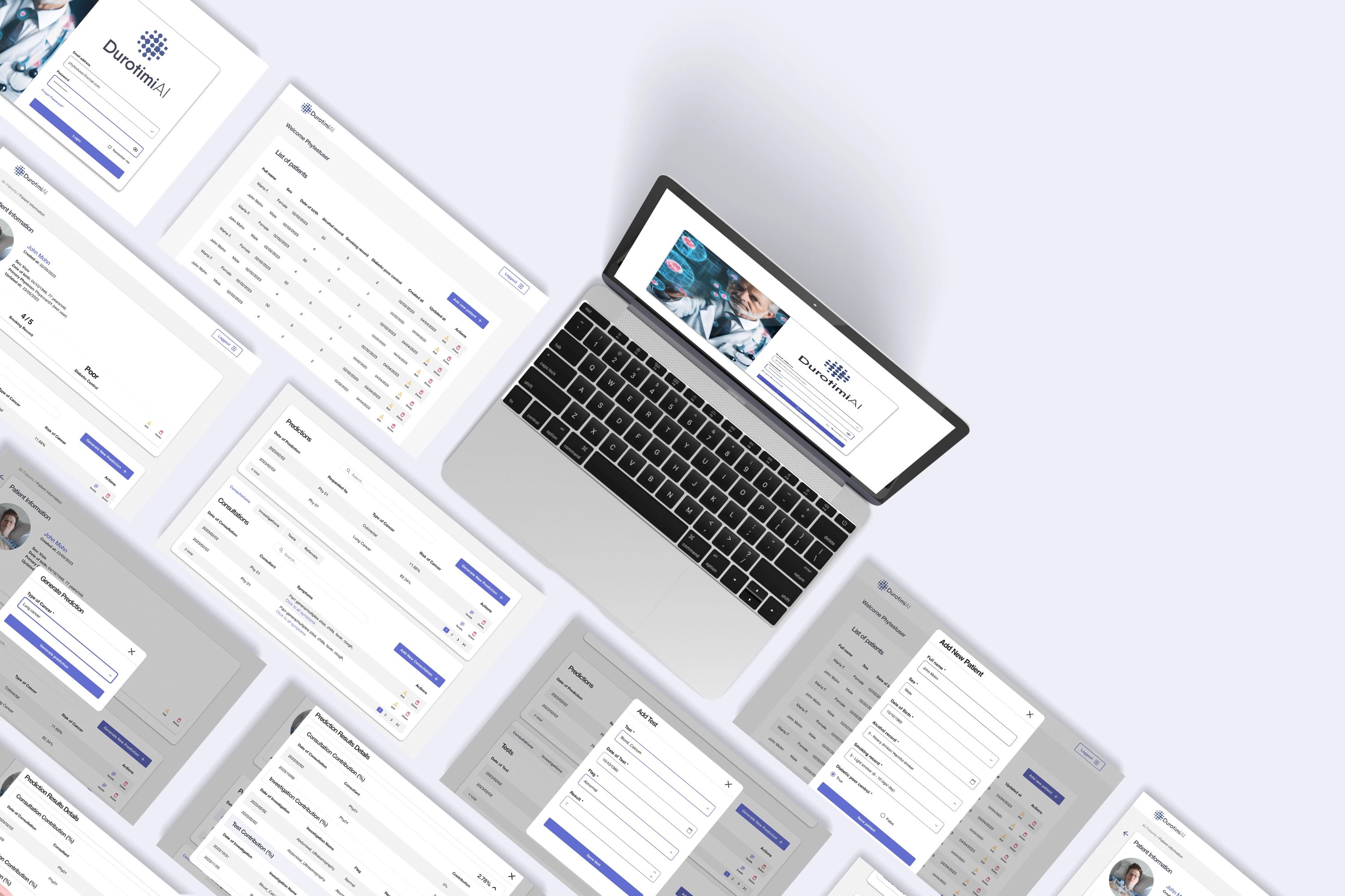
DurotimiAI Medical
SaaS Interface
PROJECT OVERVIEW
UX to Improve the cancer prediction experience to GPs
THROUGH THE PROCESS
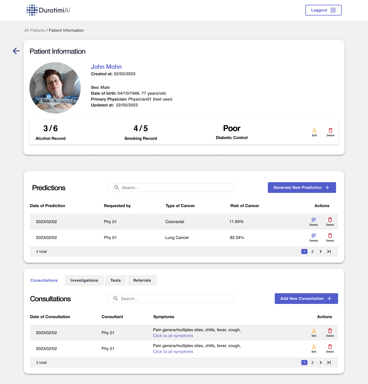
Doctors struggled with a complex SaaS for cancer prediction, facing errors and slow workflows.
After researching user needs and listening to both experienced and novice
General Practitioners, we redesigned the process, simplifying data entry and improving consistency and accuracy.
The result? A seamless experience that reduces mental effort and enhances user
interactions. This redesign also demonstrates
how Durotimiai can be easily integrated into any
medical system, boosting efficiency across platforms.
User problem
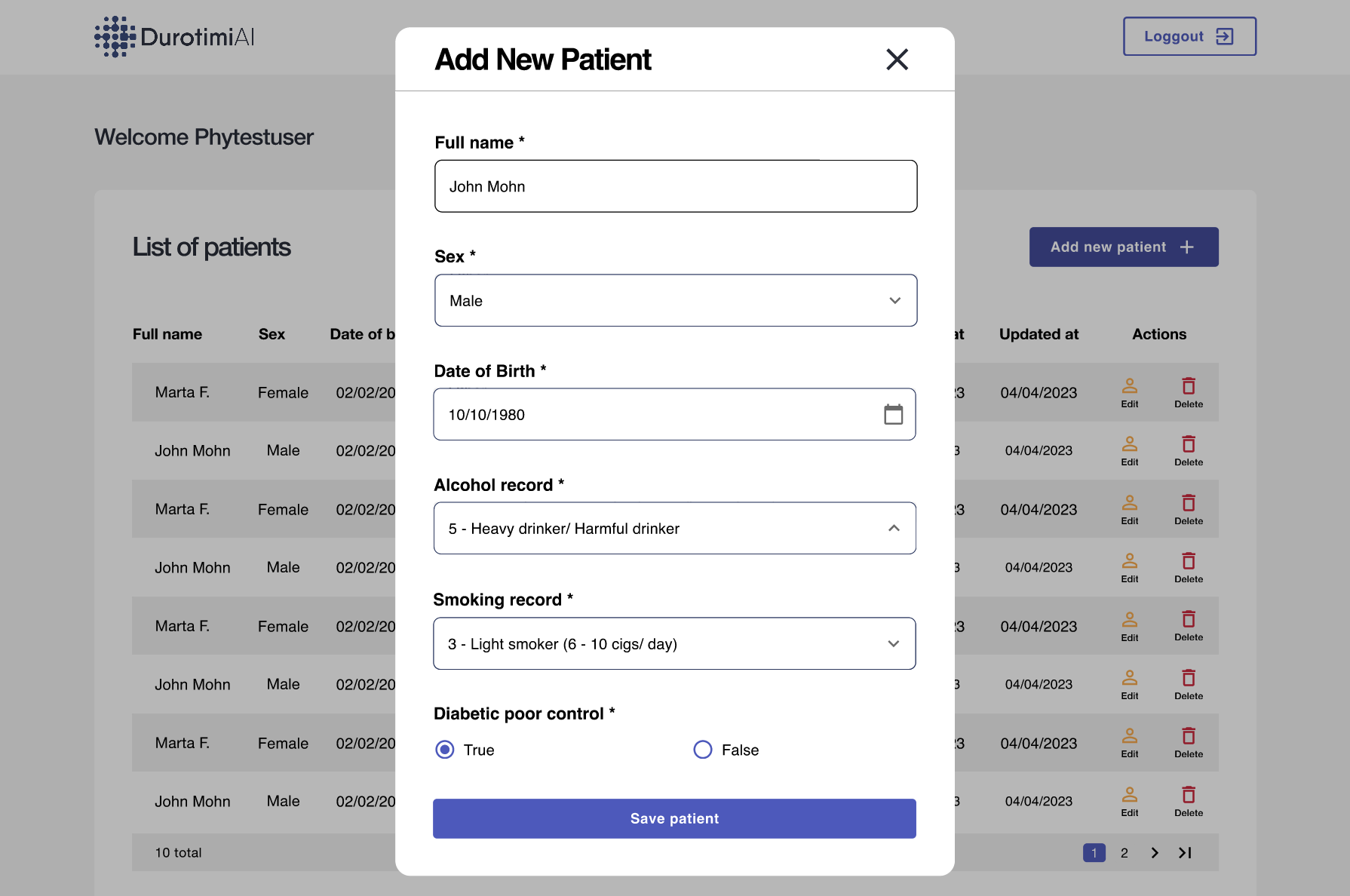
Simplify cancer prediction in a SaaS for GPs, focusing on error prevention in complex medical forms
The product
Conducted stakeholder interviews and user research to redesign the product blueprint and interaction flows
Outcomes
Reduced mental effort and improved data accuracy by optimizing navigation and streamlining sign/symptom entry
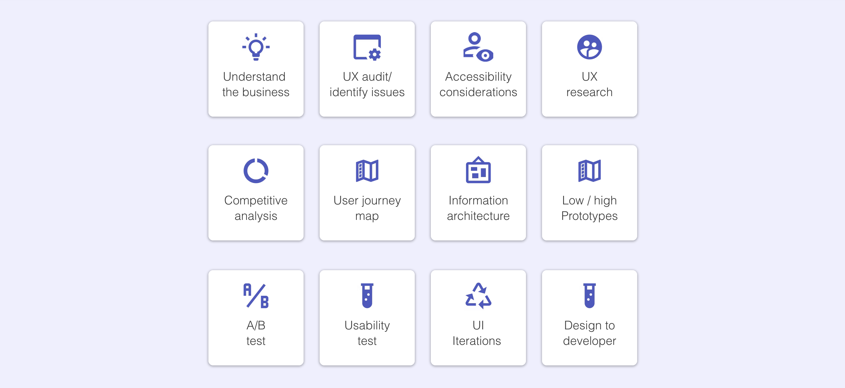
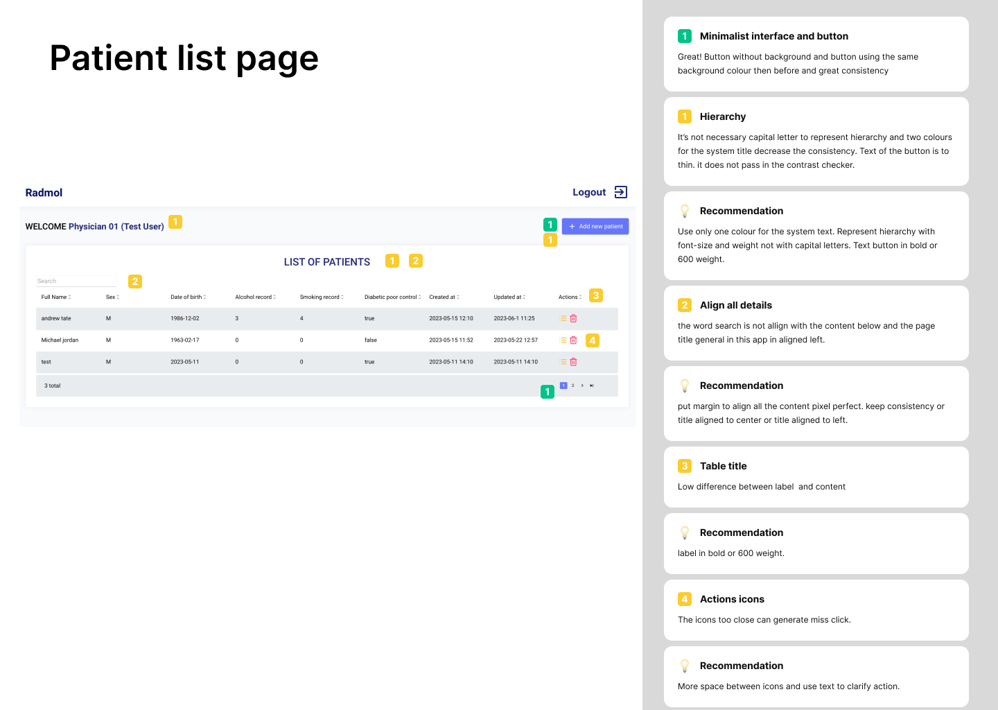
UX audit
To assess how well the interface was adhering to the 10 usability principles, such as visibility of system status, match between system and the real world, and error prevention as well as accessible principle of contrast and typographic hierarchy. To identify issues related to these principles and provide recommendations for improvement.
Competitive analysis
The research of Patient Record Systems and AI-powered cancer prediction SaaS to identify best practices, evaluate user experience, and improve the pre-existing design.

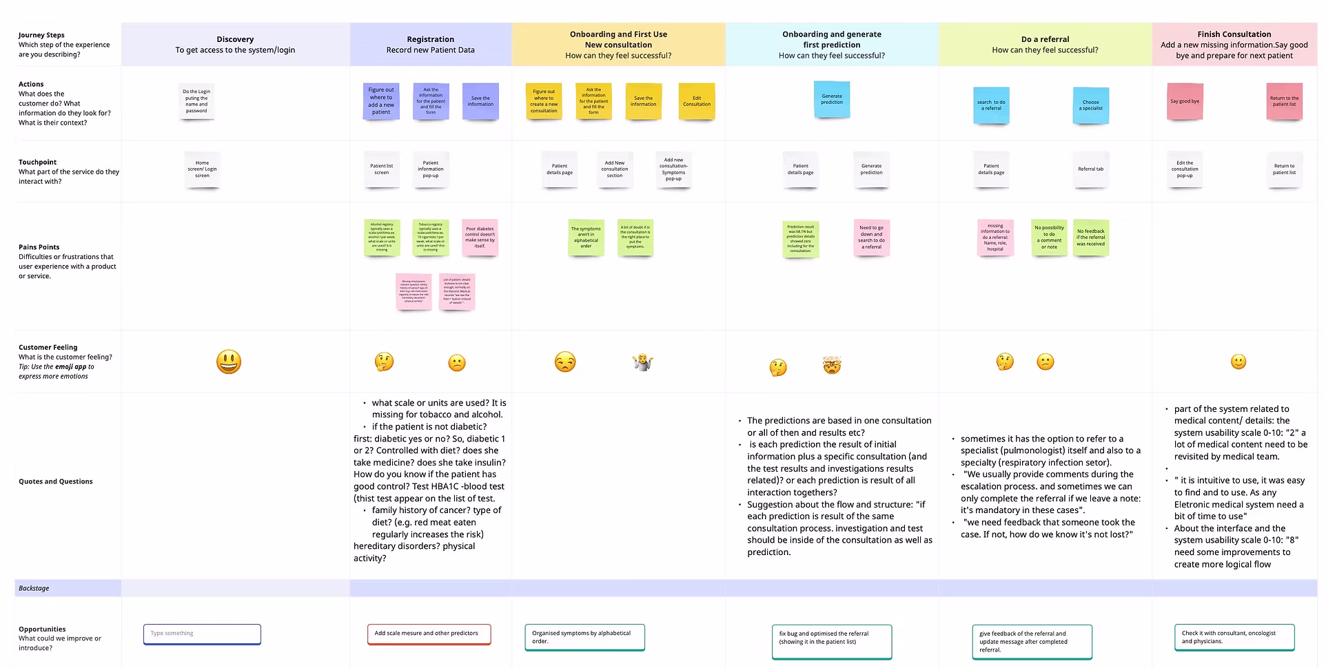
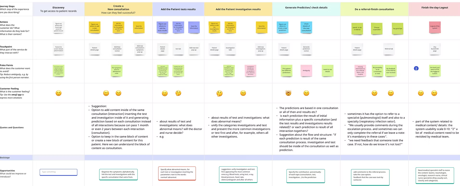
Personas and User Journey maps
Maria is an experienced General practitioners (GPs) and Paulo is GPs a novice one. The definition of personas and creating these user journey maps helped us visualize the steps and interactions the users goes through using the DurotimiAi. These tasks maps provided insights into the user's experience, identifying pain points and opportunities to guide the design process to improve the overall how the GPs experience the SaaS.
Opportunities
1
Lack of measurement units for alcohol and tobacco scales
2
Lack of measurement units for alcohol and tobacco scales
3
Lack of measurement units for alcohol and tobacco scales
4
Lack of measurement units for alcohol and tobacco scales
5
Lack of measurement units for alcohol and tobacco scales
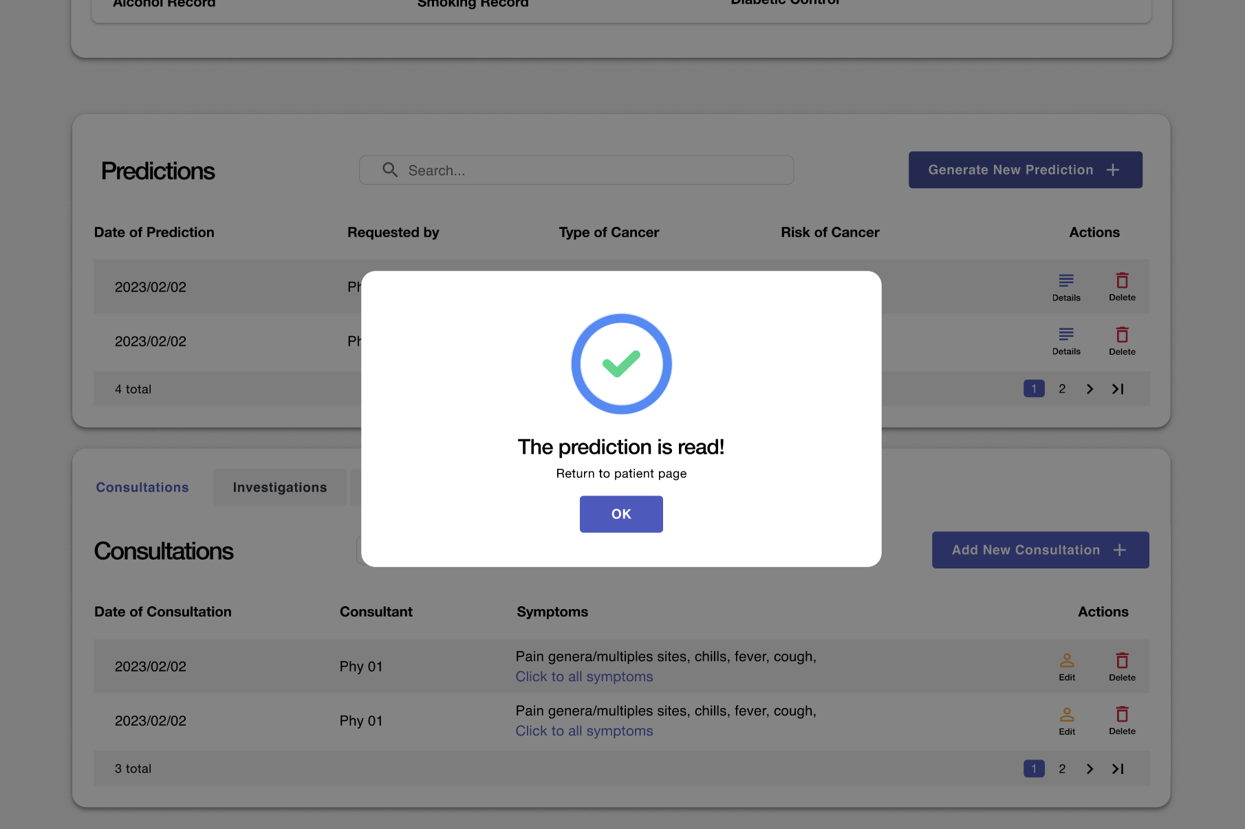
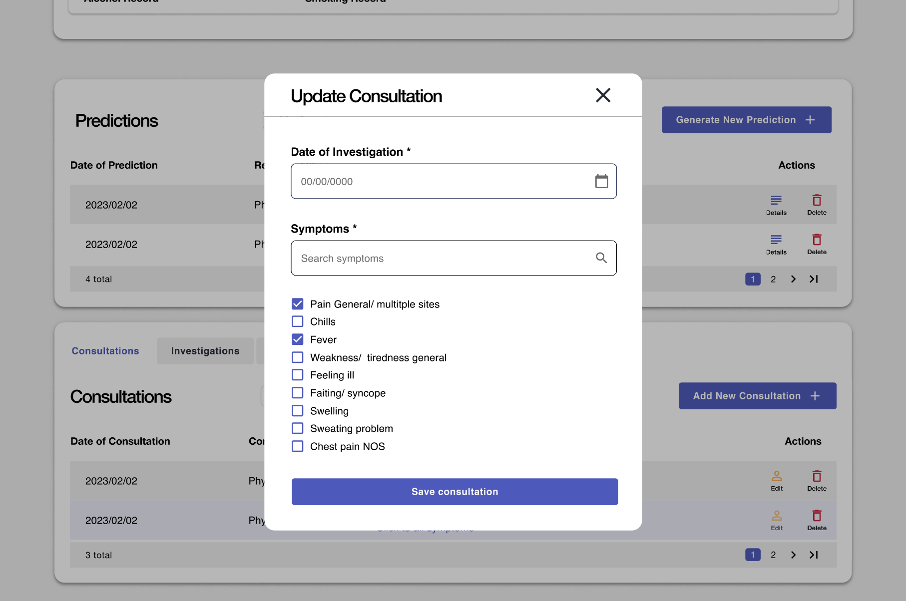
The usability study and issues uncovered
We performed an exploratory test with three users to observe the usage, behaviour and understanding of the original product. This stage aims to identify issues for resolution in the new design.
1
Lack of measurement units for alcohol and tobacco scales
2
Lack of measurement units for alcohol and tobacco scales
3
Lack of measurement units for alcohol and tobacco scales
The results
We created a high-fidelity prototype with interactions and animations, preparing it for user testing. This process led to a more intuitive, accessible, and efficient design ready for real-world application.